University of Kentucky - QPR
Web Design
The University of Kentucky offers a free training course to anyone to take a free QPR training to help all community members learn to recognize the signs of suicide. This website is the landing page used to facilitate that training.
This project centered on clarity and accessibility, translating sensitive mental-health education into a calm, easy-to-navigate experience. The design balances institutional structure with a colorful tone, built to scale and remain approachable over time.
This design included a desktop, and mobile mockup..
→ Book a project
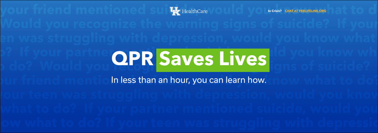
QPR program introduction with bold messaging focused on suicide prevention.
Hero: “QPR Saves Lives”
This opening section establishes urgency without alarm. The message is direct and reassuring, reinforcing that suicide prevention is learnable and actionable in a short amount of time. The background pattern subtly reinforces the emotional weight of the topic, while the bold headline and color contrast ensure immediate clarity and accessibility.
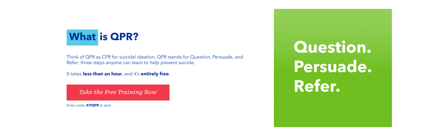
Overview of the Question, Persuade, Refer framework.
What Is QPR?
This final educational section distills the program into its core principles: Question, Persuade, Refer. The layout balances explanation with emphasis, reinforcing that suicide prevention is not about expertise—but awareness and action. Ending with a clear, free call-to-action reinforces accessibility and empowerment.
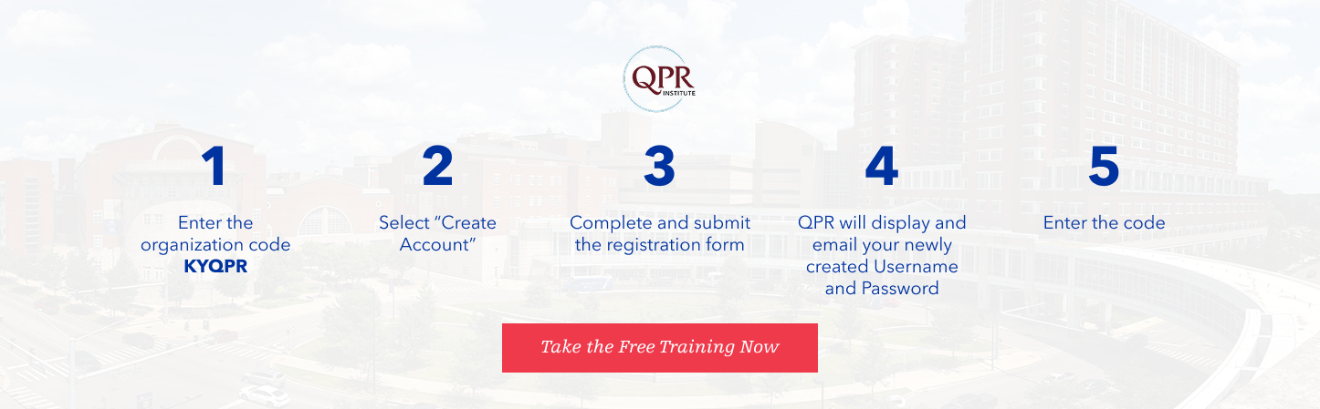
Visual walkthrough of the QPR registration process.
How QPR Works (Steps)
This step-by-step breakdown removes intimidation from the process. By visually walking users through exactly what to expect, the design builds confidence and lowers the barrier to entry. The call-to-action is intentionally placed after clarity is established, encouraging participation through understanding rather than pressure.
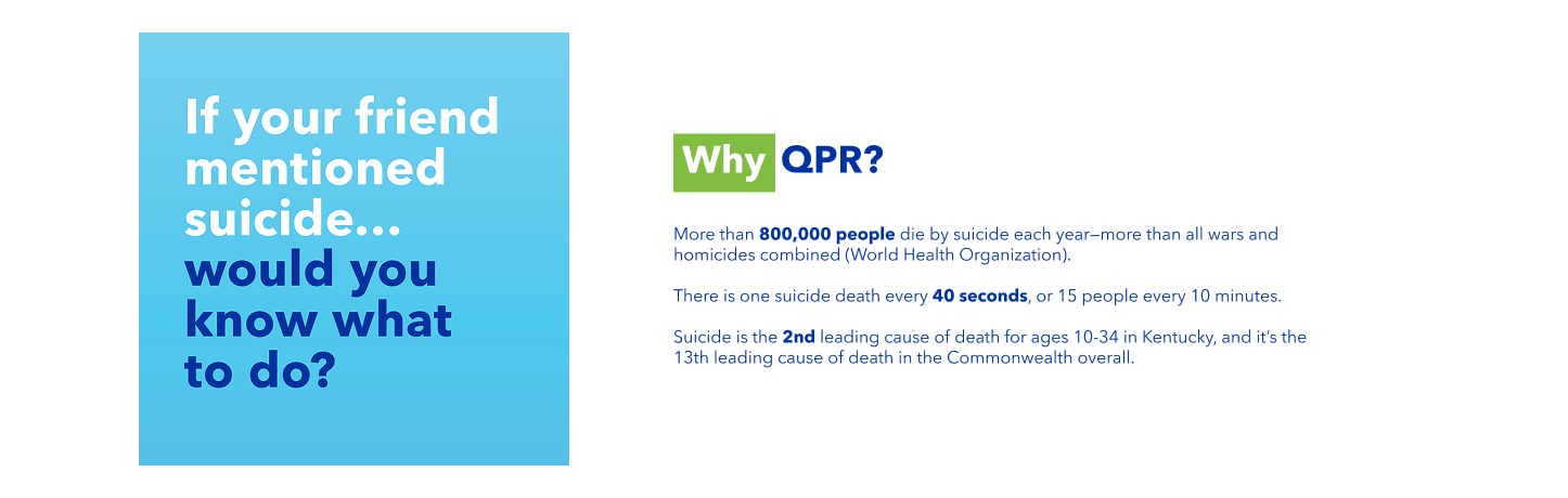
Key statistics explaining the need for QPR training.
Why QPR?
This section provides context and justification for the program using concise, factual information. The statistics are presented clearly and responsibly, helping users understand the scale of the issue without overwhelming them. The visual contrast between question-based messaging and data-driven explanation reinforces both emotional and logical engagement.
This step-by-step breakdown removes intimidation from the process. By visually walking users through exactly what to expect, the design builds confidence and lowers the barrier to entry. The call-to-action is intentionally placed after clarity is established, encouraging participation through understanding rather than pressure.
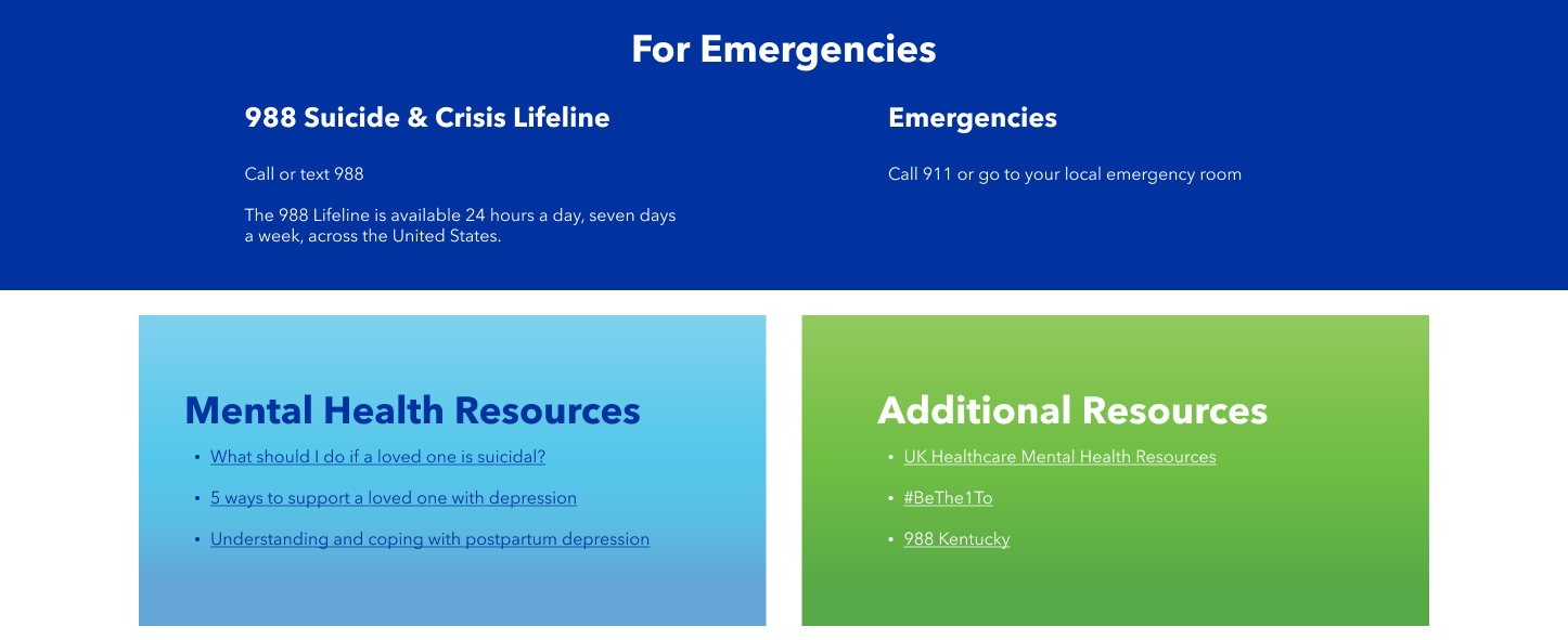
Clear access to crisis support and emergency mental health services & curated mental health and community support links.
Emergency Resources
This section prioritizes safety above all else. By clearly separating crisis-level support from general education, it ensures users can immediately find help when they need it most. The layout is intentionally simple and highly readable, removing friction during moments of stress or urgency.
Mental Health & Additional Resources
Designed as a supportive follow-up, this section offers pathways for continued learning and care beyond immediate crisis response. The split layout helps users quickly scan and identify relevant resources, reinforcing that help exists at multiple levels—personal, local, and institutional.
Disclaimer and University HealthCare footer.